Now it’s your turn to create your very own website wireframe.In the last task, you had to come up with a list of 10 questions for a briefing form. I would like you to now fill in this briefing form, take the answers and create a wireframe for the site.This wireframe do not have to be a wireframe for your current Course Assignment (Product Website) it’s purely for you to practice your skills.You can choose if you want it to be a lo-tech or hi-tech architecture. Regardless of which method you choose, I would like to see as much detail as possible. Also, please write a short paragraph to explain why you chose the lo-tech or hi-tech option.
For simplicity’s sake I will base the answers on the upcoming assignment of creating a sushi menu website.
Young and old with a love for sushi. This means that it has to be fairly simple to get an overview of the content.
The page will be simple but aim for a chic appearance. Many sushi restaurants do not even have a website, and a well-designed one at that.
15/10/21, same as the assignment deadline
A header with logo, menu, either drop down or hyperlinks to further down on the page. contact information below. Introduction part, and columns for the different sushi types and prices.
Simple but chic style, perhaps with mellow colors.
Me, of course.
Sushi, restaurant,
Header, Menu of some sort, columns for the content, information bar below. Shopping cart, buttons for adding elements to the shopping cart.
Back to top button, a visual effect that is triggered by scrolling, such as a traditional izakaya curtain that folds back upon scrolling. Feedback text box.
Initial sketches:

Wireframe
I chose to create a mobile-first oriented wire-frame with a bit of the text added to make it more understandable. The screen size it approximately that of an Iphone 8. I used Balsamiq Wireframes to create a fast and simple wireframe without having to learn a whole new complex program. Besides, it fit the purpose of this Lesson Task.
Why a Lo-tech wireframe? The budget is presumably rather small for an online sushi menu with limited content, hence the the Lo-tech wireframe. Had it been a more complex page, with more information and a greater budget, Hi-tech wireframes are to be preferred.
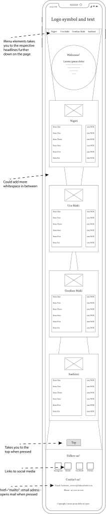
I did not add in a feedback bar, shopping cart or an «about» part as the page is sufficient as-is.
Love
Alice
Menu, contact information, cart- buttons.
- (What features are NICE to have?)
Back to top button, loading page. Animation of Logo. Fold down menu.
Love
Alice
